Adjusting Baseline
Sometimes individual letters require adjustments for their baseline. In the view, the pictures of each letter are shown, with a black line representing the baseline. You can click on a letter to select it, and once selected, drag the letter up or down as necessary to place it relative to the baseline as you like.
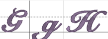
Some things like apostrophes always need adjustment, naturally, but letters with descenders like “g” or “y” will usually need adjustment also.
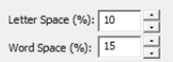
The spacing of letters between each letter and each word can be set using these boxes. The spacing is always a percentage of the font height.
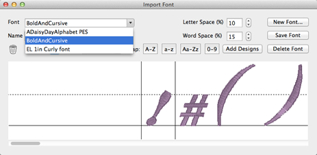
Use the Font box to select a font that you want to edit. Once the font loads, you can make adjustments to the font, such as remapping letters, adjusting sizes or positions on baseline, etc. When you have the font how you want it, click “Save Font.”
If your font is missing letters that you have now located, use the Add Designs button to open the Import dialog box to select and add the missing letters. You will need to map these new letters and save the font.
Note: Fonts must be named uniquely. If you accidentally name a font the same as an existing on, it will get a (2) added to the name.
Another Note: Long font names may run past the visible space on the font selection in the Letter properties, so we recommend shortening the font names using initials or abbreviations. Do this in the Name line under the Font list box.
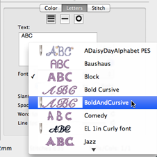
When you create a lettering design, you can now use the font that you’ve imported. Imported fonts are indicated with a needle overlaid on their icon, as seen on the picture to the left. These fonts can do almost everything that the built in fonts can do, such as make monograms, circles and even be shaped. When these letters get sized, the built-in sizing technology will recalculate their stitches.
There are however, no stitch properties for these fonts, as they are stitch-files, not our digitized objects. So removing of hidden stitches, underlay and density cannot be changed, for example.