Design pages are displayed in the Main View of the program. There can be multiple design pages open at any given time. For each page in use, a Tab control is displayed at the top of the Design page. Additional Design pages are added by clicking the New button on the Main tool bar, by pressing Ctrl-N by choosing New Page from the File menu or choosing New from the Window menu:

The Tab control will display the name of the file associated with the page once it has been saved, otherwise it is named “untitled x” where x is a running number.
The Main View has a background, a hoop, and rulers along the side and, naturally, the designs you have placed in the Design Page.
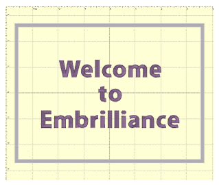
The hoop that you will view in the Main View is chosen for the Design Page using the Preferences Window. See the section under Preferences, called “Hoops.”
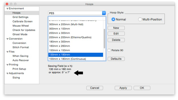
Left: Hoop selection. Right: What a hoop looks like in the Main View.
 The Navigation H.U.D.
(Heads Up Display) is an ingenious device that keeps navigation tools readily
available, yet tucked away, for easy access to the entire working area on your
Design Page. To access the Navigation H.U.D. (aka: Nav H.U.D.), click the
Compass Rose icon at the top of the zoom slider in the upper right hand area of
the main view.
The Navigation H.U.D.
(Heads Up Display) is an ingenious device that keeps navigation tools readily
available, yet tucked away, for easy access to the entire working area on your
Design Page. To access the Navigation H.U.D. (aka: Nav H.U.D.), click the
Compass Rose icon at the top of the zoom slider in the upper right hand area of
the main view.

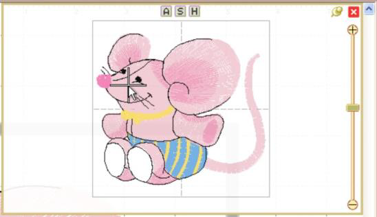
The Nav H.U.D. is especially useful when working on large designs and/or a small monitor. It quickly gives you a bird’s eye view of your work area as well as a nice “you are here” indicator. In the following image, the area around his eyes will be centered on the screen.
As you move the cursor, the ‘+’ indicates the area of focus. The panel lets you pan around the design page. The benefit is that you can make edits to different design sections while you are still zoomed in to a comfortable level.
The Nav H.U.D works in conjunction with the Pan Tool, which is accessible by holding down the spacebar.
 Hold the spacebar
and drag with this cursor to pan.
Hold the spacebar
and drag with this cursor to pan.
Whereas the Pan Tool is useful for moving around the area you are currently working in, the Nav H.U.D. makes it easy to scroll across the entire page to a specific place in one easy step.
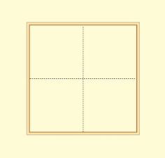
The chosen hoop is shown in the Nav H.U.D. whether that hoop is visible or not. This is because the size of your workspace is related to the size of that hoop. The selected hoop is a visual reference only and does not prevent you from designing or saving projects larger than the selected hoop or, for that matter, larger than your machine can sew.
Therefore if you have a small hoop selected and a design that well exceeds the hoop boundaries, it is possible that you won’t be able to navigate to the outer reaches of your design. The solution is to select a larger hoop from the Environment > Hoops option in the Program Preferences panel.
Same design with the hoop set to 60mm x 40mm with the
cursor shown
at the upper left limit. Parts of this design are
inaccessible.
Normally, once you’ve panned or zoomed in the Nav H.U.D. the panel will automatically close when you release the mouse. If you’d like to leave the Nav H.U.D. open while you move to several locations, click the ‘Pin’ button just to the left of the close box. Once pinned, the panel will stay open until you click out of it, or click the ‘Close’ button on the top, right in the H.U.D.


Unpinned (default setting) Pinned
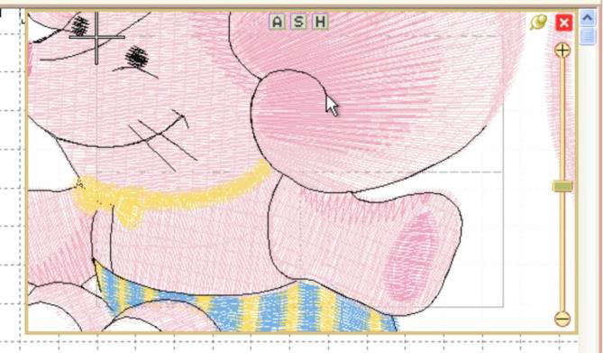
Notice on the top of the Nav H.U.D. are three small buttons labeled ‘A,’ ‘S,’ and ‘H.’ These buttons correspond to preset zoom settings of ‘All,’ ‘Selected,’ and ‘Hoop,’ whose keyboard shortcuts are respectively ‘A,’ ‘S,’ and ‘0.’
Just below the compass rose icon is a zoom slider. Slide up to zoom in; down to zoom out. Click on the ‘+’ and ‘-’ buttons to zoom in and out also. If you’ve ever used an online map, this zoom slider control should feel familiar. The slider control also responds to numeric key entry. For example, pressing 5 will move the slider control to 500%.
The lettering, the Library designs and the merged stitch files can all be sized and moved.
Note: Using some of the products, existing embroidery files can be resized with stitch recalculation. You can resize embroidery up to 250% and down to 50%. If you want to resize an existing design without stitch recalculation, hold down the Ctrl key while dragging the handle.
• If you want to resize the design in place, hold down Shift.
• Click and drag on a black handle to resize the design.
• Click and drag the round blue handle to rotate the element.
Black handles resize, round blue handle in upper right rotates.
Click and drag anywhere on a design element to move it. As the design is moved off the page, in any direction, the page will automatically scroll if the cursor is in the ruler area of the page.
For finer movements (1mm at a click), the selected design element(s) can be nudged using the keyboard arrow keys. To move objects one stitch point at a time (.1mm); hold down the control key while pressing an arrow key.
When resizing, understand that not every design can be recalculated perfectly. Some designs such as cross-stitch and freestanding lace are not going to resize correctly. Another consideration is the level of detail. Highly detailed designs radically reduced will lose clarity and crispness as the details become squished together.
Note: This is one major benefit of the Library designs; they can usually scale and calculate their stitches for you.
 The default setting for
the Main View is to display stitches in a realistic 3D, which lets you easily
see where the needles will penetrate the fabric. This can be turned off using
the ‘3D’ button on the main toolbar.
The default setting for
the Main View is to display stitches in a realistic 3D, which lets you easily
see where the needles will penetrate the fabric. This can be turned off using
the ‘3D’ button on the main toolbar.
 Zooming is
handy for edits, and this makes the process of zooming more convenient. Also,
one of the options in the program is to be able to use a mouse wheel to scroll
the design page up and down. If you have this mode on, the zoom slider is
another useful tool. Just a reminder, there are also keyboard shortcuts for
zooming: ‘z’ zooms in, and ‘Z’ (shift-z) zooms out.
Zooming is
handy for edits, and this makes the process of zooming more convenient. Also,
one of the options in the program is to be able to use a mouse wheel to scroll
the design page up and down. If you have this mode on, the zoom slider is
another useful tool. Just a reminder, there are also keyboard shortcuts for
zooming: ‘z’ zooms in, and ‘Z’ (shift-z) zooms out.
Zooming can also be accomplished with the Zoom Menu and Toolbar controls.
• ‘All’ zooms to all objects on the design page.
• ‘Selected’ zooms to selected objects on the page.
• From the Zoom menu specify what should be zoomed: the Hoop, All elements or the Selected element or choose the amount of zoom.
Tip: Memorize the keyboard shortcuts for the Zooming and Panning; using them can speed your designing!
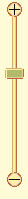 Use the Zoom slider to
zoom on the Main view. Up zooms in, down zooms out.
Use the Zoom slider to
zoom on the Main view. Up zooms in, down zooms out.
There are zooming keyboard shortcuts:
• ‘z’ to zoom in
• ‘Z’ to zoom out.
• 0 = Fit Hoop
• ‘A’ to zoom all
• ‘S’ to zoom selected
• 1 - 9 will zoom to 100%-900% of real-world scale.
 The scroll bars at the
right and bottom of the Main View can be used to scroll the view around, which
is very useful when you are zoomed in.
The scroll bars at the
right and bottom of the Main View can be used to scroll the view around, which
is very useful when you are zoomed in.
There is also a mode that allows you to ‘Pan’ the design, which works like a scroll, but where you move the view by dragging the mouse. Hold the space bar down and drag the mouse to pan the view.
As you drag on the main view, you may come near the edge of the page. This will cause the page to scroll thus enabling you to drag into a position that’s not currently in view.
Rulers exist along the top and left sides of the main view.
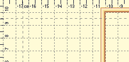
They indicate location from the center of the hoop. You can switch the rulers between metric and inches using the radio buttons on the Tool pane or by double-clicking in the size window in the status bar.
You can also drag rules onto the Main view. Move the mouse over one of the rulers and drag down into the view. If you later want to move the rules, you can drag them. If you want to remove them, you can drag them one at a time back onto the ruler.

The Magnifier on the Main toolbar will let you change the zoom in three ways after you click on it:
• Left-click to zoom in
• Right-click to zoom out
• Drag a rectangle to zoom on just that area. (This will also cancel the tool.)
Note: The Overview or Navigation window can alter the zoom too, and we’ll cover that in its own chapter.
 You can alter the background of the Main View. Click the Preferences
button on the Main toolbar. This will bring up the Program Preferences window,
which allows you to set many program and Design Page options. Click on the Grid
Settings to adjust them.
You can alter the background of the Main View. Click the Preferences
button on the Main toolbar. This will bring up the Program Preferences window,
which allows you to set many program and Design Page options. Click on the Grid
Settings to adjust them.


To change the background color, click the Color button, which will display a standard color picker:
You can even create your own colors and add them to the custom colors section.
Select a Custom color and click OK to set the new color.
Adjustments:
• The Grid is adjustable too. You can alter the display of gridlines by choosing between lines and dots. You can also set the spacing of the grid, and that can be set separately for both metric and inch settings.
• The arrow buttons, labeled “>>” and “<<,” will copy the settings from inches to metric and vice versa. Thus, you can set up a grid that has metric spacing for machine/hoop accuracy, but can display information to you in inches.
• Snap-to-Grid will help align objects to the grids as you move them in the Main View. As you move in one direction (up, down, left, right) the edge of whatever you are moving will ‘stick’ like a magnet to the grid as you approach a grid line in that direction. If you want to overcome the snap-to-grid, you can pass the grid and then come back in the reverse direction. (Which means the opposite edge will want to snap to some other grid.)
• Grids do not force you to stick to them when Snap-to-Grid is on. Rather, it merely enables the snap as you get close, which may help with precision alignment as you move things around.
• Using the menu or the Grid button on the toolbar, you can turn the Main View display of the grid on and off.
 The Measure button on the Main toolbar will set the program in
a mode, which allows you to measure items in the Main View.
The Measure button on the Main toolbar will set the program in
a mode, which allows you to measure items in the Main View.
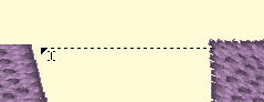
As you drag the cursor, you are measuring the distance you’ve dragged. This distance is displayed on the status bar:

To cancel measuring, click again on the Measure button in the toolbar, or click the Selection Tool (arrow) in the toolbar. Items that are selected also have their size, stitch count and color count shown in the status bar. If nothing is selected, then the size and counts for the entire Design Page will be shown.

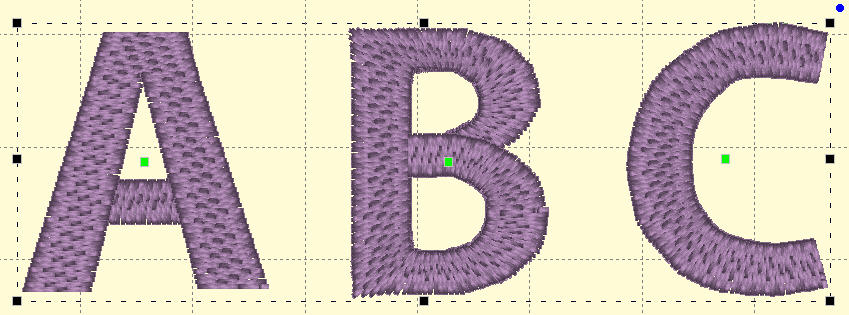
 One
of the most common tasks in the Main view is to select items. Using the
Selection Tool (Arrow button on the main toolbar) you can select and move items
in the design page. Select items by clicking on them. This will place ‘handles’
and a dotted line around the selected items.
One
of the most common tasks in the Main view is to select items. Using the
Selection Tool (Arrow button on the main toolbar) you can select and move items
in the design page. Select items by clicking on them. This will place ‘handles’
and a dotted line around the selected items.
You can also see that items are selected by looking in the Objects view. Another way to select items in the Main view is to drag a rectangle around those items. Anything completely in the rectangle will be selected. However, if an object is grouped with something outside the rectangle, it will not be selected.
Ghost Mode is an option relating to how the Main View displays objects when not selected. The idea for Ghost Mode is to make it more obvious which objects are selected by fading out those items that are not selected.
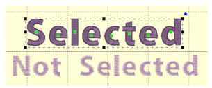
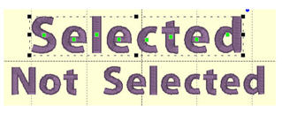
Left: Ghost Mode on. Right: Ghost Mode off.

The intensity of the Ghost Mode can be altered with the Preferences.